Week1 - Build a Responsive Web Page
This is the first week assignment, The only requirement is not to use any css/javascript framework to build this responsive webpage.
I use html5, css3 and javascript to build this webpage, has it tested on the latest chrome, firefox, safari, and microsoft edge.
Though, css/javascript framework is not allowed, I do use css preprocess (SCSS) to improve my workflow. Below is my toolset.
Toolset
Text-editor
vim
I use vim as my text-editor.
This time, I made my own css snippets. though, emmet is a very powerful tool, still, be able to make one’s own snippets can always have a big impact on productivity.
Build tool
Webpack
Spent almost two days working on my build process. Read this great article written by the author of survive.js, Juho Vepsäläinen, it is about how to setup your webpack configs, optimize building performance, so that I don’t have to wait too long when made any changes.
Language
HTML5 / CSS3(SCSS)
I use CSS 3 flex property as main way to construct the layout. After playing this flexbox froggy game at least twice, I finally grasp the design concept of flex box.
Javascript
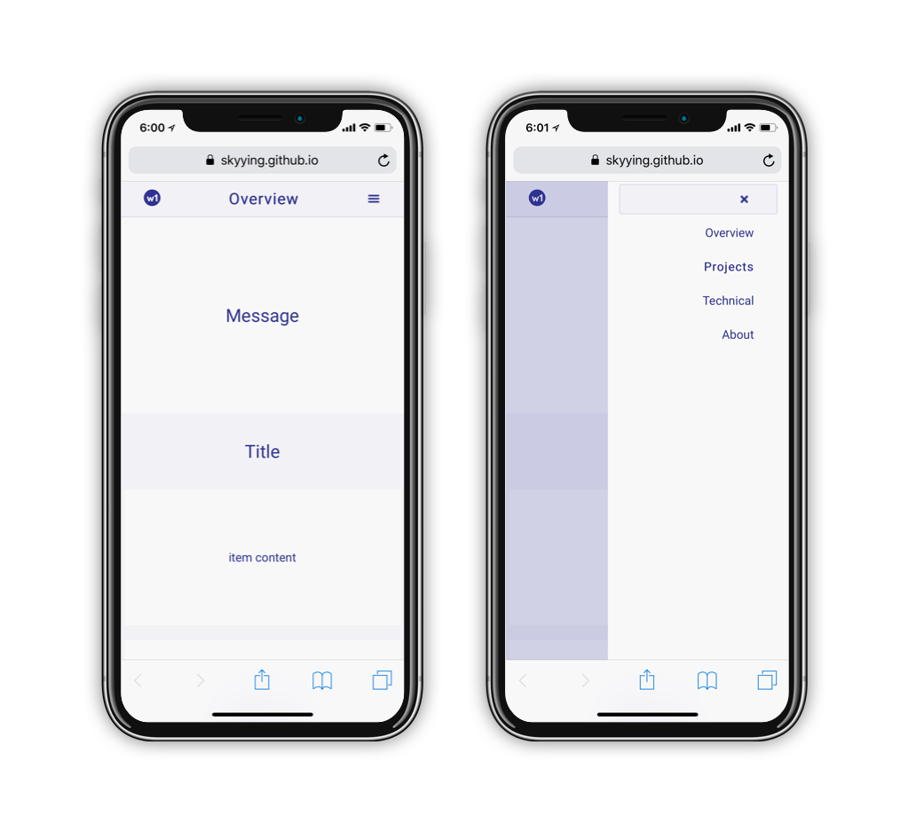
still, there are some interaction involved, and it need javascript’s help with it. I use javascript to handle the click event on toggle menus.
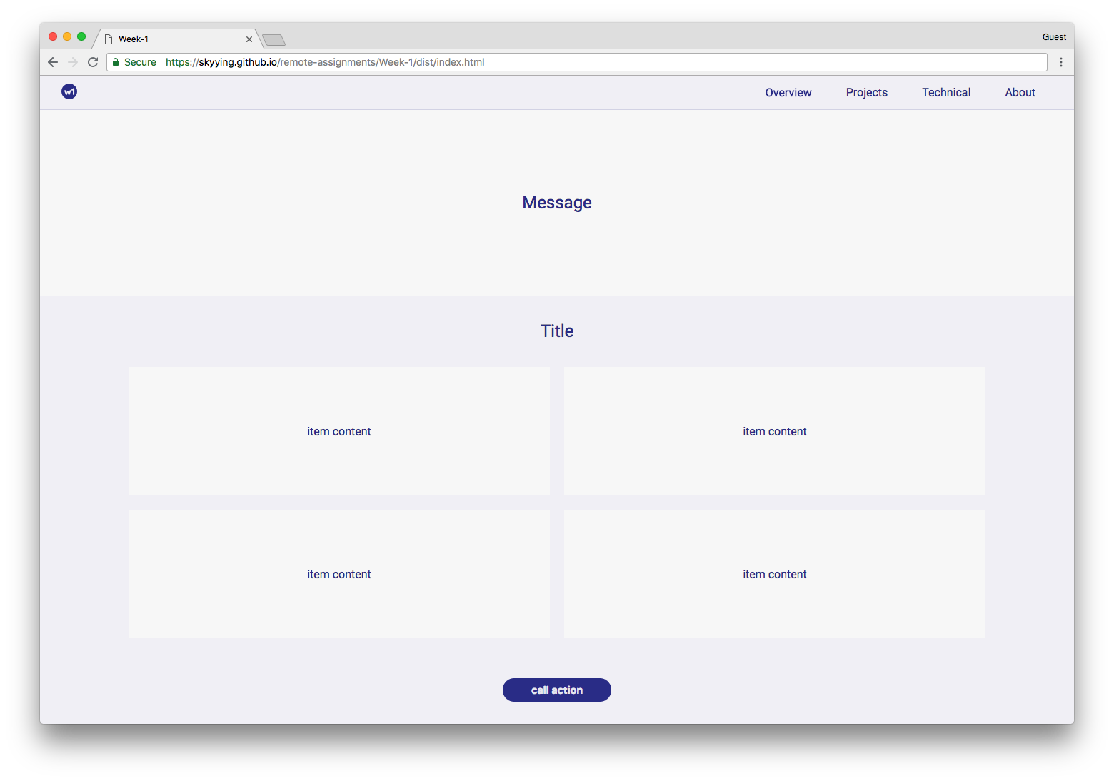
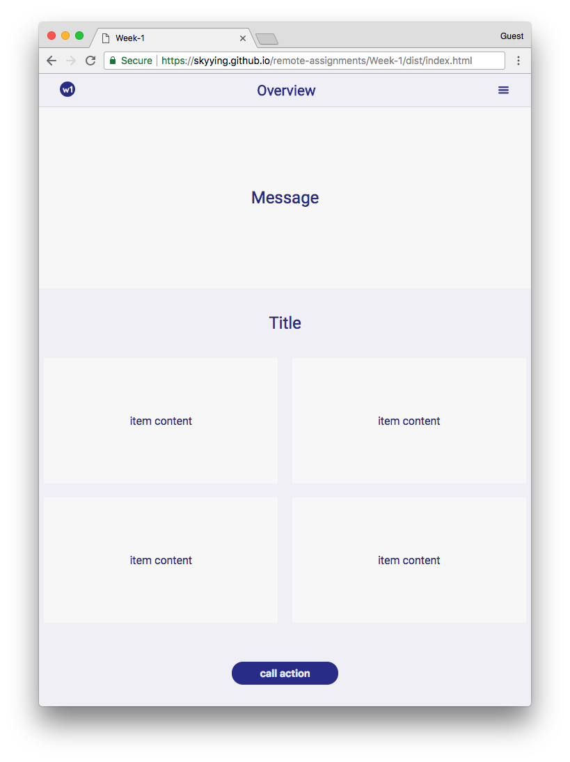
Showcase
Demo
on mobile
800px > width > 500px
width > 800px